
Brand Identity
A professional visual identity gives your business a stronger, more credible first impression. We create custom, distinctive identities that help businesses look more professional and established, stand apart from competitors, and build stronger brand recognition.
View Details
Crab Shack Caribba
Crab Shack’s original logo had personality, but its detailed, cartoon-like style made it harder to use consistently across signage, menus, apparel, packaging, and digital applications. The updated logo simplifies the brand into a cleaner, stronger, and more recognizable identity. The new crab icon feels more professional, more versatile, and better suited for building a consistent brand across every customer touchpoint.
Regional Eye
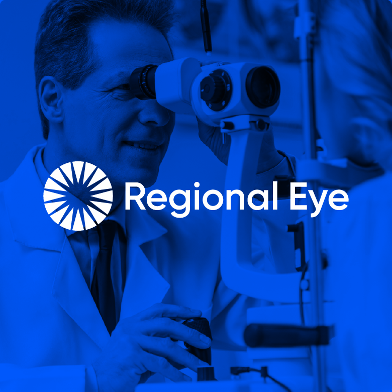
Regional Eye’s original logo looked more like an illustration from a textbook than a professional brand identity, making it feel dated, overly literal, and difficult to use consistently. The updated logo simplifies the concept into a clean, modern mark that references vision and focus in a more polished and memorable way. With clearer typography, a stronger icon, and a more refined visual style, the new identity gives Regional Eye a more professional, trustworthy, and recognizable brand presence.
RIKA Detailing
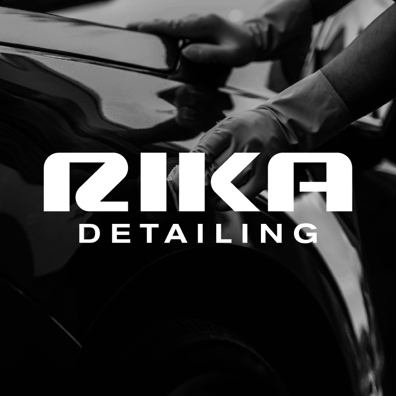
RIKA’S original logo felt too playful and did not fully reflect the premium nature of the business or the type of clientele they serve. For customers who invest in professional vehicle care, the brand needed to feel more refined, confident, and high-end. The updated logo creates a cleaner, more sophisticated identity with bold automotive-inspired typography and a much stronger visual presence. The result is a brand that feels more professional, more desirable, and better aligned with clients who value quality, convenience, and attention to detail.
NetNutri
NetNutri’s original logo felt dated and was too closely aligned with visual cues associated with other supplement brands, making it harder for NetNutri to stand apart in a competitive online marketplace. As an ecommerce company focused on health, wellness, and nutritional supplements, the brand needed an identity that felt more ownable, modern, and trustworthy. The updated logo simplifies the name into a cleaner, more distinctive wordmark with a brighter color system that better reflects health, energy, and forward movement. The result is a more professional and memorable identity that helps NetNutri build strong brand recognition while creating a clearer separation from competitors.
Van Deysen Law
Van Deysen’s original logo relied on dated typography and lacked a distinct icon or central element of focus, making it less memorable and less reflective of the trust, strength, and professionalism clients look for in a law firm. For a practice focused on estate planning, Medicaid planning, probate, guardianship, and asset protection, the brand needed to feel more established, confident, and reassuring. The updated identity creates a stronger presence with a refined wordmark and a shield-and-lion icon that suggests protection, guidance, and authority. The result is a more professional and memorable brand that better reflects the firm’s role in helping clients protect what matters most.
Sepic Orthodontics
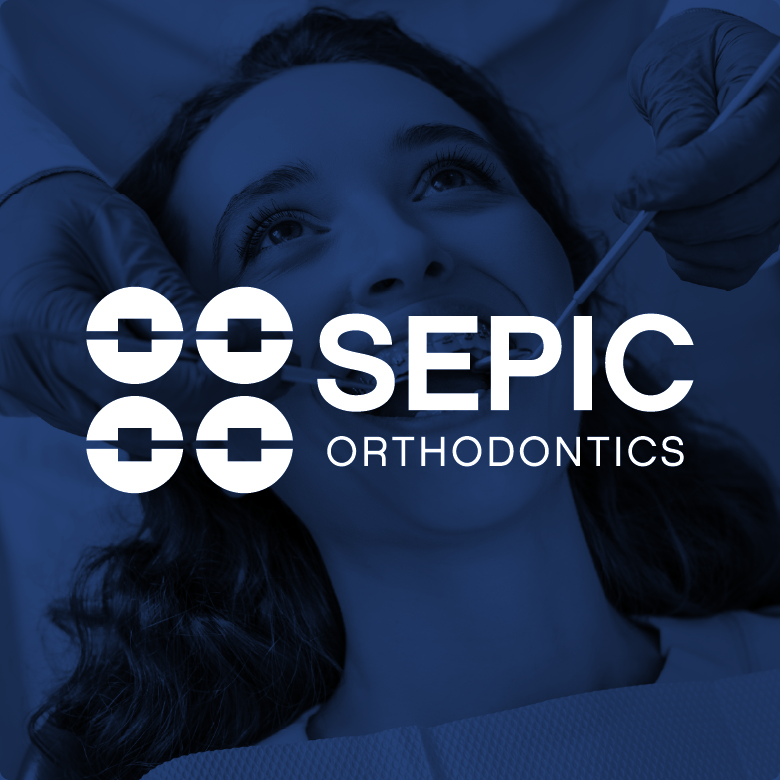
Sepic Orthodontics’ original logo felt dated, overly illustrative, and less aligned with the clean, professional experience patients expect from an orthodontic practice. The updated identity creates a much more polished and contemporary brand presence with stronger typography and a simple, memorable icon. The new mark uses an abstract arrangement of braces on teeth, creating a visual connection to orthodontic care without being too literal or complex. The result is a cleaner, more versatile logo that feels professional, approachable, and easier to recognize across signage, apparel, marketing materials, and digital platforms.
H&H Water
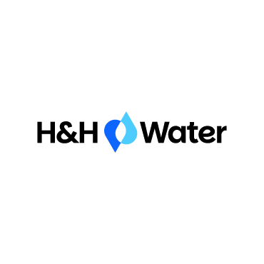
H&H Water’s original logo felt dated and the gradients were hard to reproduce consistently. As a trusted water management partner providing facility management, certified operators, regulatory consulting, and lab and water quality testing, the brand needed to feel cleaner, stronger, and more professional. The updated identity simplifies the name, strengthens recognition, and uses a clean and professional icon that creates an immediate connection to the company’s services. The result is a more modern and versatile logo that better reflects H&H’s role in helping communities protect water quality, maintain compliance, and operate with confidence.

Bel-Cross Properties
Bel-Cross’s original logo was dated and visually crowded, making it harder to communicate the professionalism and trust clients expect from an established real estate and property management company. As a firm serving buyers, sellers, tenants, and property owners, Bel-Cross needed an identity that felt clearer, more confident, and easier to recognize. The updated logo introduces cleaner typography and a stronger icon that references property and connection. The result is a more modern and versatile brand identity that better reflects Bel-Cross Properties as an experienced real estate partner.
Ready to elevate your image?


