
Brand Identity
A professional visual identity gives your business a stronger, more credible first impression. We create custom, distinctive identities that help businesses look more professional and established, stand apart from competitors, and build stronger brand recognition.
View Details
Quantum Bean Coffee
Quantum Bean’s original logo introduced the idea of a science-inspired coffee brand, but the thin lines, small details, and stretched layout made it difficult to read and harder to use consistently. The updated identity keeps the quantum-inspired concept, but presents it in a cleaner, bolder, and more structured way. The new icon combines an atomic orbit with the subtle shape of a coffee mug viewed from above, creating a stronger connection to both the Quantum Bean name and the coffee experience. The result is a more professional, memorable, and versatile logo that works better across packaging, signage, cups, merchandise, and digital platforms.
Koval Supply
Koval’s original logo felt dated and less reflective of the quality, experience, and range of products Koval provides today. As a trusted source for kitchen and bath design, hot tubs, swim spas, fireplaces, stoves, and commercial plumbing supplies, the brand needed an identity that felt stronger, more established, and easier to recognize. The updated logo keeps the name front and center with bold, timeless typography and a cleaner visual system that feels more confident and professional. The result is a more versatile brand identity that better supports Koval’s role as a trusted resource for home, leisure, and commercial building solutions.
MidAtlantic Energy Services
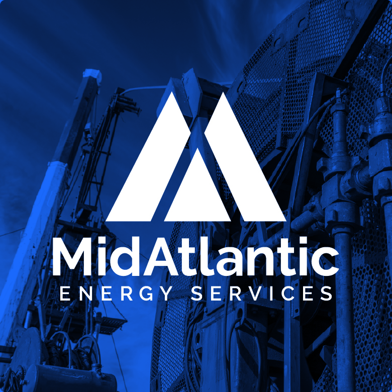
MidAtlantic’s original logo had a dated feel and lacked the strength, clarity, and confidence needed for an experienced oil and gas service company working in demanding field environments. As a company providing well site services including coiled tubing, snubbing, fluid pumps, nitrogen pumps, and nitrogen transport, MidAtlantic needed an identity that felt more capable, reliable, and professional. The updated logo creates a stronger presence with a bold icon and cleaner typography that is easier to recognize and reproduce. The result is a more modern and versatile brand identity that better reflects MidAtlantic’s role as a trusted partner for tough projects in the Appalachian Basin.
Dyer Group
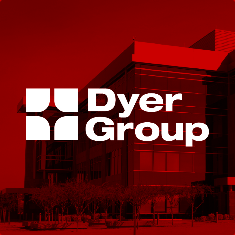
Dyer’s original logo was dated, narrow, and lacked a clear icon or central element of focus, making it harder to build strong visual recognition. As an established insurance group with a long history of helping clients prepare for the future, the brand needed an identity that felt more confident, modern, and dependable. The updated logo introduces cleaner typography and a simple geometric icon designed to represent light, vision, and guidance. The result is a stronger and more versatile identity that feels established, trustworthy, and better suited for building recognition across every client touchpoint.
Empty Bowls Monongalia
Empty Bowls’ original logo was difficult to read, with unnecessary outlines around the lettering and an icon that felt too small in relation to the name. As a nonprofit focused on increasing awareness of hunger and supporting local agencies that serve people facing food insecurity, Empty Bowls Monongalia needed an identity that felt more meaningful, recognizable, and community-centered. The updated logo creates a stronger presence with a simplified bowl icon, cleaner typography, and a more balanced visual system. The result is a more professional and memorable identity that better reflects the organization’s role in bringing people together and fighting hunger.
MTC
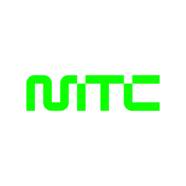
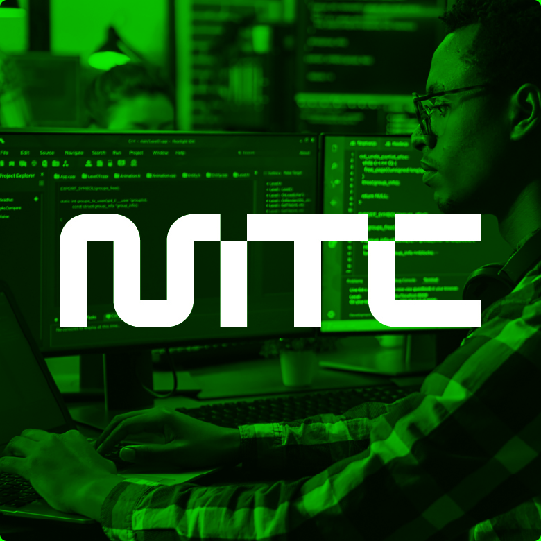
MTC’s original logo felt more like an outdoor or regional tourism brand than a modern technology consultancy, which made it harder to immediately understand what the company does. As MTC evolved around a clearer promise of making IT easy for businesses, organizations, and schools, the brand needed an identity that felt more focused, simple, and digitally relevant. The updated logo simplifies the name into a bold, modern lettermark that communicates strength, innovation, and technology with a cleaner visual presence. The result is a more professional and memorable identity that better reflects MTC’s role as a trusted IT partner.
TriState Exterminating
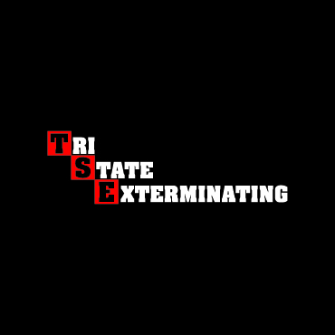
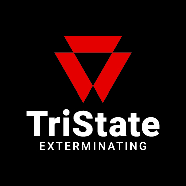
TriState’s original logo felt dated, uneven, and hard to read, which limited the professionalism of a company with decades of experience in pest control. As a family-owned business serving residential and commercial customers across Morgantown, surrounding counties, and Southwestern Pennsylvania, TriState needed an identity that felt stronger, cleaner, and more dependable. The updated logo introduces a bold, simplified icon and a clearer font that is easier to recognize and reproduce across trucks, uniforms, signage, and digital platforms. The result is a more professional and memorable identity that better reflects prompt service, experience, and trust.
RMD Roofing
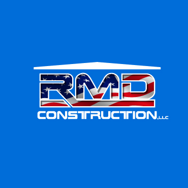
RMD’s original logo was overly detailed, difficult to read, and hard to reproduce consistently. While the roof shape was simple, the lettering was crowded with outlines, gradients, flag imagery, and shadows, which made the mark feel inconsistent and less professional. The updated logo simplifies the brand into a cleaner, stronger, and more modern identity. It is easier to read, easier to recognize, and better suited for building brand association across vehicles, signage, apparel, and digital platforms.
Ready to elevate your image?


