
Brand Identity
A professional visual identity gives your business a stronger, more credible first impression. We create custom, distinctive identities that help businesses look more professional and established, stand apart from competitors, and build stronger brand recognition.
View Details
Bad Lizard Granite & Quartz
Bad Lizard’s original logo was much too detailed, difficult to reproduce consistently, and hard to read at smaller sizes. Its illustrated character, ornate typography, and heavily stylized look gave the brand the wrong impression, feeling more like a biker bar or tattoo parlor than a professional company. The updated identity simplifies the brand into a cleaner, bolder, and more versatile logo system that is easier to recognize and remember. The result is a stronger brand presence that builds recognition while better reflecting the quality, craftsmanship, and professionalism behind Bad Lizard.
USARK
USARK’s original logo lacked the professional presence needed for a national advocacy organization representing reptile keepers, responsible private ownership, and the reptile industry. Its dated effects, complex styling, and weaker readability made the brand harder to use confidently in legislative, legal, and public-facing settings. The updated identity creates a cleaner, stronger, and more credible presence with bold typography, a patriotic color system, and a direct message that reinforces the organization’s purpose. The result is a more polished and memorable brand that better supports USARK’s role in education, advocacy, and protecting the rights of reptile keepers.
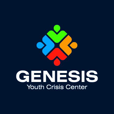
Genesis Youth Crisis Center
Genesis’ original logo was highly detailed, difficult to reproduce clearly, and impossible to read at smaller sizes. For an organization focused on providing a safe haven, inspiring hope, and helping at-risk youth and families move toward stronger, healthier lives, Genesis needed an identity that felt more welcoming, professional, and mission-driven. The updated logo simplifies the brand into a cleaner and more recognizable system, using connected human forms to represent support, care, community, and transformation. The result is a stronger identity that feels more approachable, memorable, and aligned with the organization’s purpose.
Trilogy
Trilogy’s original logo felt dated and less aligned with the level of expertise expected from a federal IT services company. As Trilogy evolved into a trusted technology partner providing application services, cloud services, cybersecurity, data analytics, biometrics, and software integration, the brand needed an identity that felt more confident, modern, and credible. The updated logo simplifies the brand with a clean bold circular icon that suggests movement, connection, and innovation. The result is a stronger, more memorable identity that better reflects Trilogy’s role in delivering high-quality technology solutions for complex environments.
Daniel’s
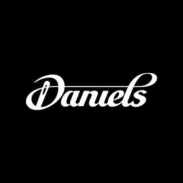
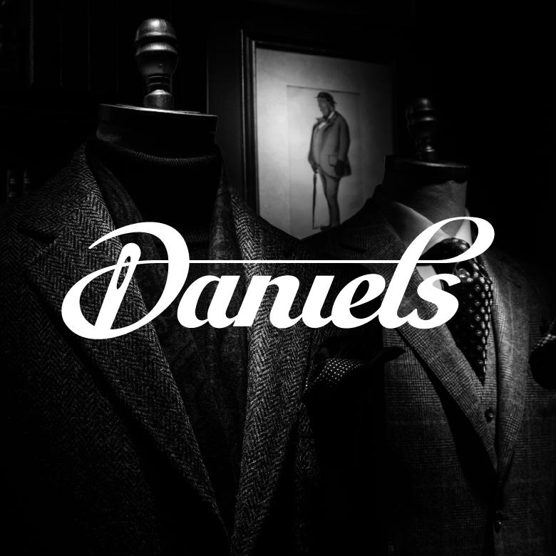
Daniel’s original logo used a dated font with uneven styling which made the brand feel less refined than the men’s fashion and personalized service that they provide. As a store known for high-quality suits, premium menswear, made-to-measure options, and in-house tailoring, the identity needed to feel more polished, timeless, and carefully crafted. The updated logo keeps an elegant, established look while refining the letters and incorporating a threaded needle through the “D,” creating a subtle connection to tailoring and custom fit. The result is a more sophisticated and memorable identity that better reflects the quality, style, and craftsmanship behind the Daniel’s experience.
Royal Water Treatment
Royal Water’s original logo was extremely dated and lacked the strength, clarity, and professionalism needed for a company built around clean water and trusted service. The updated identity creates a stronger brand presence with bold typography and a clean, purposeful icon that combines a crown with water drops, connecting directly to the Royal Water Treatment name. The new logo is easier to recognize, more versatile across applications, and better positioned to communicate credibility, quality, and confidence.
Reach Out Reptiles
ROR’s original logo was highly illustrative, overly detailed, and difficult to reproduce consistently across different applications. As one of the most recognized names in dwarf and super dwarf reticulated pythons, Reach Out Reptiles needed an identity that was simpler, stronger, and easier for people to recognize and remember. The updated logo creates a cleaner brand system while still honoring the company’s Pittsburgh roots through an abstract city skyline and bridge-inspired wordmark. By also incorporating the snake into the icon, the new identity connects the company’s location, specialty, and “Bridge Between Worlds” message in a more professional and memorable way.
Pro Performance
Pro Performance’s original logo felt dated and less aligned with the energy, coaching, and results-driven experience the company provides today. As a fitness brand offering gym memberships, personal training, group training, online training, and athletic development, they needed an identity that felt stronger, cleaner, and easier to recognize. The updated logo simplifies the brand with a bold mark and a more refined star icon, while the red triangle subtly represents the three core areas of the business: the gym, personal training, and online training. The result is a more modern and memorable identity that better reflects performance, progress, and professional coaching.
Ready to elevate your image?


