
Brand Identity
A professional visual identity gives your business a stronger, more credible first impression. We create custom, distinctive identities that help businesses look more professional and established, stand apart from competitors, and build stronger brand recognition.
View Details
Schall Electric
Schall Electric’s original logo felt dated and less refined, with a script style that made the brand harder to read and less versatile across different applications. It also had two competing points of focus, the lightning bolt and the electrical plug, which distracted from each other and made the logo less memorable. The updated identity simplifies the brand around one strong visual idea, combining the “S” initial with a lightning bolt in a cleaner, more professional mark. The result is a more modern and recognizable identity that is easier to remember, easier to reproduce, and better suited for building strong brand recognition.
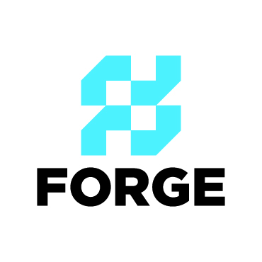
FORGE Business Solutions
Forge’s original logo was dated and overly decorative, which made it harder to communicate the strength, clarity, and strategic focus of the company. As a consulting firm built around strategic planning, business development, organizational growth, and government and community relations, Forge needed an identity that felt more confident and professional. The updated logo creates a bold, modern brand presence with cleaner typography and a structured icon made from two abstract “F” forms being forged together. The result is a stronger, more versatile identity that suggests alignment while better reflecting the company’s role in helping organizations grow with purpose and direction.
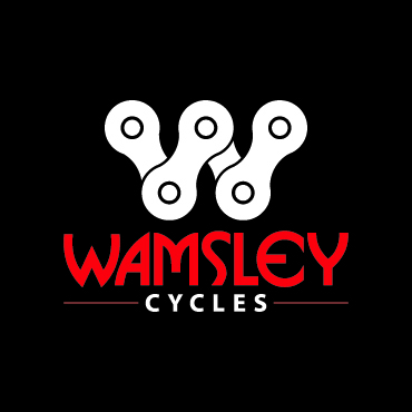
Wamsley Cycles
The original Wamsley logo felt dated, overly complex, and difficult to read at smaller sizes, which made it harder for the brand to stand out consistently across signage, apparel, bikes, service materials, and digital platforms. As a full-service bike shop offering sales, repairs, rentals, and bike fitting, Wamsley needed an identity that felt more modern, recognizable, and connected to the cycling community. The updated logo introduces a stronger and simplified icon that combines a custom “W” with the form of a bike chain. The result is a more memorable and versatile identity that better reflects Wamsley Cycles as a trusted bicycle specialist.
Marion County Parks & Recreation
MCPARC’s original logo was dated and the small text was difficult to read, which made it harder to represent the energy and value of a countywide parks and recreation organization. With parks, programs, pools, reservations, trails, and community activities, MCPARC needed an identity that felt more welcoming, active, and easy to recognize. The updated logo creates a cleaner and more memorable brand presence with a simple outdoor icon that references mountains, water, sunshine, and open space. The result is a stronger and more versatile identity that better reflects the organization’s mission to create places where people can play, connect, and learn.
Elite Gasfield Services
Elite’s original logo’s older styling, fonts, and gradients made the brand feel dated and was hard to reproduce consistently. As a company providing water and fluid hauling, heavy equipment logistics, winch truck services, and oilfield support, Elite needed an identity that felt stronger, cleaner, and more dependable. The updated logo keeps the bold energy of the brand while introducing a more professional icon that combines a water drop with two directional arrows, representing hauling to and from job sites. The result is a more recognizable and versatile identity that better communicates safety, performance, and reliability in demanding field environments.
Amos Reptiles
Amos Reptiles’ original logo was difficult to read and relied on detailed snake illustrations that made the brand harder to reproduce consistently across different applications. As a breeder focused on designer ball python morphs, Amos Reptiles needed an identity that felt cleaner, more professional, and easier for customers to recognize. The updated logo introduces a clean bold icon that subtly references both a snake and the “A” in Amos. The result is a stronger and more memorable brand identity that better reflects the quality, care, and specialization behind the animals they produce.

Davis Home Inspections
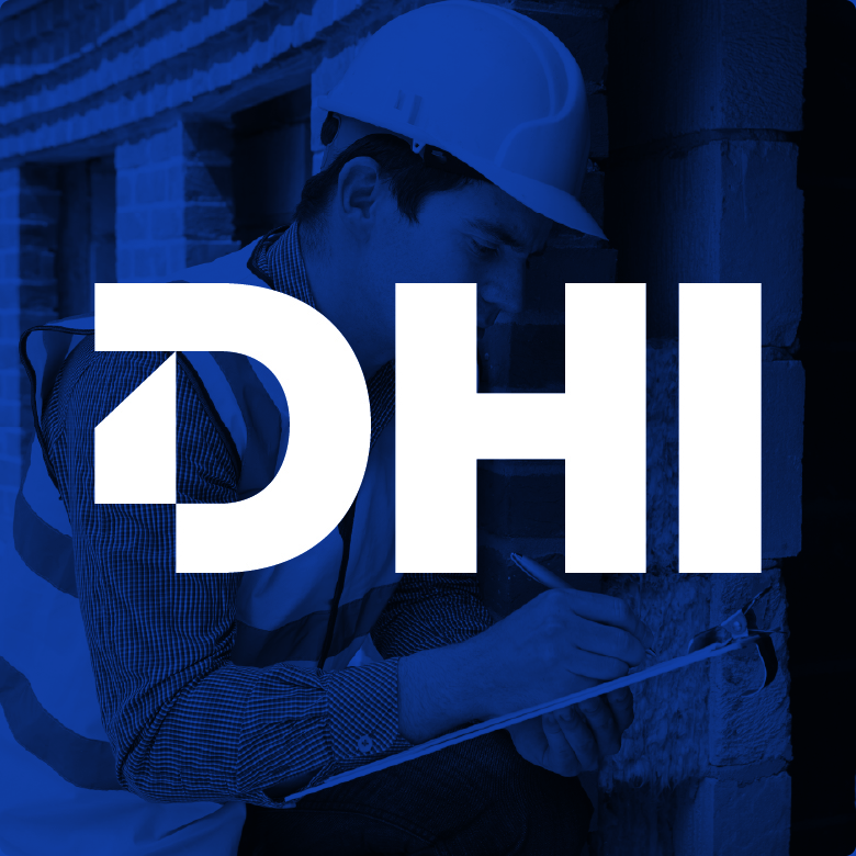
DHI’s original logo relied on a familiar home inspection cliché, showing a house through a magnifying glass, which made it harder for the brand to stand apart in the industry. As the company moved toward being known more simply as DHI, the identity needed to become stronger, cleaner, and easier to recognize. The updated logo creates a bold lettermark built around the initials, giving the brand a more memorable and professional presence. The customized “D” also forms a simple outline of a house, creating a subtle connection to home inspections without relying on an overused visual idea.
Roman’s Acupuncture & Wellness
Roman’s original logo used very fine lines in both the icon and lettering, which made it harder to scale, reproduce clearly, and use consistently across different applications. As a wellness center offering acupuncture, spa services, natural healing, and advanced wellness treatments, the brand needed an identity that felt cleaner, more balanced, and more trustworthy. The updated logo introduces a strong and simplified organic icon that feels natural, calming, and easier to recognize. The result is a more polished and memorable identity that better reflects Roman’s focus on helping clients feel their best through personalized wellness care.
Ready to elevate your image?


